Skip to content

Reset css height/maxHeight values to default when animation stops - #100356

Merged
NicolasBonet merged 1 commit into
Expensify:mainfrom
s77rt:accordion-reset-css-style-correctly
Sep 3, 2026
Merged

Reset css height/maxHeight values to default when animation stops#100356
NicolasBonet merged 1 commit into
Expensify:mainfrom
s77rt:accordion-reset-css-style-correctly

Conversation

@s77rt

@s77rt s77rt commented Sep 3, 2026

Copy link
Copy Markdown
Member

Explanation of Change

When the Accordion animation stops, the resolved height/maxHeight are undefined, this makes it look like these values will clear the custom height/maxHeight and reset to default but actually these undefined are no-op (does nothing) and whatever the last derived height/maxHeight was stays as is. This is a problem when we dynamically add more content to that accordion content, since the height/maxHeight are fixed the new content will be cropped.

The fix is to reset the height/maxHeight correctly to their defaults i.e. auto/none resp.

Fixed Issues

$ #100351
PROPOSAL:

Tests

  • Have a workspace
  1. Go to workspace settings > Reports
  2. Enable Report fields
  3. Click Add field
  4. Enter name and select Text type
  5. Click Save
  6. Verify added field is fully displayed (i.e. not cutoff)
Screen.Recording.2026-09-03.at.9.16.54.PM.mov
  • Verify that no errors appear in the JS console

Offline tests

Same as Tests

QA Steps

Same as Tests

  • Verify that no errors appear in the JS console

PR Author Checklist

  • I linked the correct issue in the ### Fixed Issues section above
  • I wrote clear testing steps that cover the changes made in this PR
    • I added steps for local testing in the Tests section
    • I added steps for the expected offline behavior in the Offline steps section
    • I added steps for Staging and/or Production testing in the QA steps section
    • I added steps to cover failure scenarios (i.e. verify an input displays the correct error message if the entered data is not correct)
    • I turned off my network connection and tested it while offline to ensure it matches the expected behavior (i.e. verify the default avatar icon is displayed if app is offline)
    • I tested this PR with a High Traffic account against the staging or production API to ensure there are no regressions (e.g. long loading states that impact usability).
  • I included screenshots or videos for tests on all platforms
  • I ran the tests on all platforms & verified they passed on:
    • Android: Native
    • Android: mWeb Chrome
    • iOS: Native
    • iOS: mWeb Safari
    • MacOS: Chrome / Safari
  • I verified there are no console errors (if there's a console error not related to the PR, report it or open an issue for it to be fixed)
  • I followed proper code patterns (see Reviewing the code)
    • I verified that comments were added to code that is not self explanatory
    • I verified that any new or modified comments were clear, correct English, and explained "why" the code was doing something instead of only explaining "what" the code was doing.
    • I verified any copy / text that was added to the app is grammatically correct in English. It adheres to proper capitalization guidelines (note: only the first word of header/labels should be capitalized), and is either coming verbatim from figma or has been approved by marketing (in order to get marketing approval, ask the Bug Zero team member to add the Waiting for copy label to the issue)
  • If a new code pattern is added I verified it was agreed to be used by multiple Expensify engineers
  • I followed the guidelines as stated in the Review Guidelines
  • I tested other components that can be impacted by my changes (i.e. if the PR modifies a shared library or component like Avatar, I verified the components using Avatar are working as expected)
  • If a new CSS style is added I verified that:
    • A similar style doesn't already exist
    • The style can't be created with an existing StyleUtils function (i.e. StyleUtils.getBackgroundAndBorderStyle(theme.componentBG))
  • If new assets were added or existing ones were modified, I verified that:
    • The assets are optimized and compressed (for SVG files, run npm run compress-svg)
    • The assets load correctly across all supported platforms.
  • If the PR modifies code that runs when editing or sending messages, I tested and verified there is no unexpected behavior for all supported markdown - URLs, single line code, code blocks, quotes, headings, bold, strikethrough, and italic.
  • If the PR modifies a generic component, I tested and verified that those changes do not break usages of that component in the rest of the App (i.e. if a shared library or component like Avatar is modified, I verified that Avatar is working as expected in all cases)
  • If the PR modifies a component related to any of the existing Storybook stories, I tested and verified all stories for that component are still working as expected.
  • If the PR modifies a component or page that can be accessed by a direct deeplink, I verified that the code functions as expected when the deeplink is used - from a logged in and logged out account.
  • If the PR modifies the UI (e.g. new buttons, new UI components, changing the padding/spacing/sizing, moving components, etc) or modifies the form input styles:
    • I verified that all the inputs inside a form are aligned with each other.
    • I added Design label and/or tagged @Expensify/design so the design team can review the changes.
  • I added unit tests for any new feature or bug fix in this PR to help automatically prevent regressions in this user flow.
  • If the main branch was merged into this PR after a review, I tested again and verified the outcome was still expected according to the Test steps.

Screenshots/Videos

Android: Native
Android: mWeb Chrome
iOS: Native
iOS: mWeb Safari
MacOS: Chrome / Safari

@codecov

codecov Bot commented Sep 3, 2026

Copy link
Copy Markdown

Codecov Report

✅ Changes either increased or maintained existing code coverage, great job!

Files with missing lines Coverage Δ
src/components/Accordion/index.tsx 0.00% <0.00%> (ø)
... and 6 files with indirect coverage changes

@s77rt
s77rt marked this pull request as ready for review September 3, 2026 20:27
@s77rt
s77rt requested review from a team as code owners September 3, 2026 20:27
@melvin-bot
melvin-bot Bot requested review from dmkt9 and truph01 September 3, 2026 20:27
@melvin-bot
melvin-bot Bot requested review from flaviadefaria and removed request for a team September 3, 2026 20:27
@melvin-bot

melvin-bot Bot commented Sep 3, 2026

Copy link
Copy Markdown

@truph01 @dmkt9 One of you needs to copy/paste the Reviewer Checklist from here into a new comment on this PR and complete it. If you have the K2 extension, you can simply click: [this button]

@NicolasBonet

NicolasBonet commented Sep 3, 2026

Copy link
Copy Markdown
Contributor

Reviewer Checklist

  • I have verified the author checklist is complete (all boxes are checked off).
  • I verified the correct issue is linked in the ### Fixed Issues section above
  • I verified testing steps are clear and they cover the changes made in this PR
    • I verified the steps for local testing are in the Tests section
    • I verified the steps for Staging and/or Production testing are in the QA steps section
    • I verified the steps cover any possible failure scenarios (i.e. verify an input displays the correct error message if the entered data is not correct)
    • I turned off my network connection and tested it while offline to ensure it matches the expected behavior (i.e. verify the default avatar icon is displayed if app is offline)
  • I checked that screenshots or videos are included for tests on all platforms
  • I included screenshots or videos for tests on all platforms
  • I verified that the composer does not automatically focus or open the keyboard on mobile unless explicitly intended. This includes checking that returning the app from the background does not unexpectedly open the keyboard.
  • I verified tests pass on all platforms & I tested again on:
    • Android: HybridApp
    • Android: mWeb Chrome
    • iOS: HybridApp
    • iOS: mWeb Safari
    • MacOS: Chrome / Safari
  • If there are any errors in the console that are unrelated to this PR, I either fixed them (preferred) or linked to where I reported them in Slack
  • I verified proper code patterns were followed (see Reviewing the code)
    • I verified that comments were added to code that is not self explanatory
    • I verified that any new or modified comments were clear, correct English, and explained "why" the code was doing something instead of only explaining "what" the code was doing.
    • I verified any copy / text that was added to the app is grammatically correct in English. It adheres to proper capitalization guidelines (note: only the first word of header/labels should be capitalized), and is either coming verbatim from figma or has been approved by marketing (in order to get marketing approval, ask the Bug Zero team member to add the Waiting for copy label to the issue)
  • If a new code pattern is added I verified it was agreed to be used by multiple Expensify engineers
  • I verified that this PR follows the guidelines as stated in the Review Guidelines
  • I verified other components that can be impacted by these changes have been tested, and I retested again (i.e. if the PR modifies a shared library or component like Avatar, I verified the components using Avatar have been tested & I retested again)
  • If a new component is created I verified that:
    • A similar component doesn't exist in the codebase
    • All props are defined accurately
    • The component has a clear name that is non-ambiguous and the purpose of the component can be inferred from the name alone
    • The only data being stored in the state is data necessary for rendering and nothing else
    • The component has the minimum amount of code necessary for its purpose, and it is broken down into smaller components in order to separate concerns and functions
  • If a new CSS style is added I verified that:
    • A similar style doesn't already exist
    • The style can't be created with an existing StyleUtils function (i.e. StyleUtils.getBackgroundAndBorderStyle(theme.componentBG)
  • If the PR modifies code that runs when editing or sending messages, I tested and verified there is no unexpected behavior for all supported markdown - URLs, single line code, code blocks, quotes, headings, bold, strikethrough, and italic.
  • If the PR modifies a generic component, I tested and verified that those changes do not break usages of that component in the rest of the App (i.e. if a shared library or component like Avatar is modified, I verified that Avatar is working as expected in all cases)
  • If the PR modifies a component related to any of the existing Storybook stories, I tested and verified all stories for that component are still working as expected.
  • If the PR modifies a component or page that can be accessed by a direct deeplink, I verified that the code functions as expected when the deeplink is used - from a logged in and logged out account.
  • If the PR modifies the UI (e.g. new buttons, new UI components, changing the padding/spacing/sizing, moving components, etc) or modifies the form input styles:
    • I verified that all the inputs inside a form are aligned with each other.
    • I added Design label and/or tagged @Expensify/design so the design team can review the changes.
  • For any bug fix or new feature in this PR, I verified that sufficient unit tests are included to prevent regressions in this flow.
  • If the main branch was merged into this PR after a review, I tested again and verified the outcome was still expected according to the Test steps.
  • I have checked off every checkbox in the PR reviewer checklist, including those that don't apply to this PR.

@NicolasBonet
NicolasBonet merged commit f29a3da into Expensify:main Sep 3, 2026
39 of 41 checks passed
@github-actions

github-actions Bot commented Sep 3, 2026

Copy link
Copy Markdown
Contributor

🚧 NicolasBonet has triggered a test Expensify/App build. You can view the workflow run here.

@OSBotify

OSBotify commented Sep 3, 2026

Copy link
Copy Markdown
Contributor

✋ This PR was not deployed to staging yet because QA is ongoing. It will be automatically deployed to staging after the next production release.

OSBotify pushed a commit that referenced this pull request Sep 3, 2026
…ctly

Reset css height/maxHeight values to default when animation stops

(cherry picked from commit f29a3da)

(cherry-picked to staging by francoisl)
@OSBotify OSBotify added the CP Staging marks PRs that have been CP'd to staging label Sep 3, 2026
@os-botify

os-botify Bot commented Sep 3, 2026

Copy link
Copy Markdown

🔁 Filed a Staging retest request for deploy blockers #100351 after this PR was cherry-picked to staging.

@OSBotify

OSBotify commented Sep 3, 2026

Copy link
Copy Markdown
Contributor

🚀 Cherry-picked to staging by https://github.com/francoisl in version: 9.4.70-1 🚀

platform result
🕸 web 🕸 success ✅
🤖 android 🤖 success ✅
🍎 iOS 🍎 success ✅

@MelvinBot

Copy link
Copy Markdown
Contributor

🤖 No help site changes are required for this PR, so no draft docs PR was created.

Why: This PR changes two style values in the shared Accordion component (src/components/Accordion/index.tsx:80-81), swapping undefined for 'auto'/'none' so the animated container resets its height/maxHeight when the animation stops.

Assessment details

What changed: 1 file, +2/-2. Only the resolved height and maxHeight values in the animated style.

User-visible effect: Content added to an expanded accordion is no longer cropped. Fixes the report field row and Add field button being cut off in Workspace settings > Reports, reported in #100351.

Why no docs update:

  • No new feature, setting, or workflow. The change restores the behavior the help site already describes.
  • No UI text, label, tab name, or button name was added, removed, or renamed.
  • No step in any existing article becomes wrong or incomplete.
  • Help site articles document what you can do, not rendering or animation internals. A visual regression fix in a shared component has no article-level counterpart.
  • Nothing under docs/articles references the accordion component or the cropped-content behavior.

Per HELP_AUTHORING_GUIDELINES.md, articles cover customer-facing tasks and concepts. A bug fix that makes existing documented behavior work correctly does not warrant an article change.

@s77rt — since there is no help site change to make, there is no linked docs PR to review. If you think a specific article needs updating anyway, tell me which one and what it should say, and I'll create the draft PR.


view run

@OSBotify

OSBotify commented Sep 4, 2026

Copy link
Copy Markdown
Contributor

🚀 Cherry-picked to staging by https://github.com/francoisl in version: 9.4.72-0 🚀

platform result
🕸 web 🕸 success ✅
🤖 android 🤖 success ✅
🍎 iOS 🍎 success ✅

@OSBotify

OSBotify commented Sep 7, 2026

Copy link
Copy Markdown
Contributor

🚀 Deployed to production by https://github.com/mountiny in version: 9.4.72-2 🚀

platform result
🕸 web 🕸 success ✅
🤖 android 🤖 success ✅
🍎 iOS 🍎 success ✅

Bundle Size Analysis (Sentry):

@OSBotify

OSBotify commented Sep 7, 2026

Copy link
Copy Markdown
Contributor

🚀 Cherry-picked to staging by https://github.com/francoisl in version: 9.4.73-0 🚀

platform result
🕸 web 🕸 success ✅
🤖 android 🤖 success ✅
🍎 iOS 🍎 failure ❌

@MelvinBot

MelvinBot commented Sep 7, 2026

Copy link
Copy Markdown
Contributor

No help site changes are required for this PR

This PR changes two style values in src/components/Accordion/index.tsx so a collapsed accordion resets height/maxHeight to auto/none instead of leaving stale fixed values behind. It fixes a rendering glitch. It adds no feature, renames no label, and changes no user flow.

Help site articles document what a feature does and the steps to use it. Nothing in App/docs/articles describes accordion animation or the cropping behavior, so there is nothing to update. I did not create a draft PR, and there is no linked help site PR to review.


Separate finding: the Report fields article is out of date

While checking this PR's flow against the live UI, I found that App/docs/articles/new-expensify/workspaces/Enable-Report-Fields.md no longer matches the product. This drift is pre-existing and unrelated to this PR — none of it was introduced here.

Article says Live UI shows
Enable via More Features The toggle is on the Reports tab. More features has no report fields entry.
Report Fields Report fields
Add Field Add field
Field Type Type
Three types: Text, Date, List Four types: Text, Date, List, Formula
UI evidence

The Report fields toggle on the Reports tab:
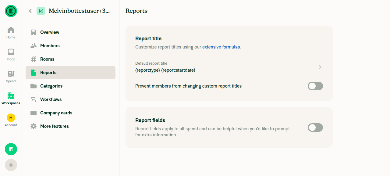
Reports tab showing Report fields section with toggle off

The Add field button after enabling the toggle:
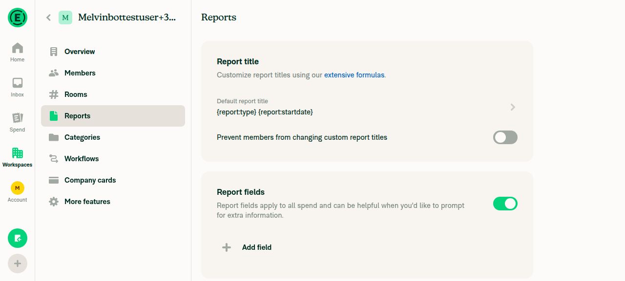
Report fields toggle enabled, showing the Add field button

The Name and Type rows on the Add field page:
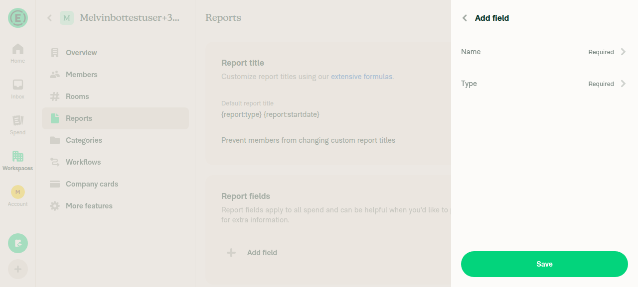
Add field page with Name and Type rows

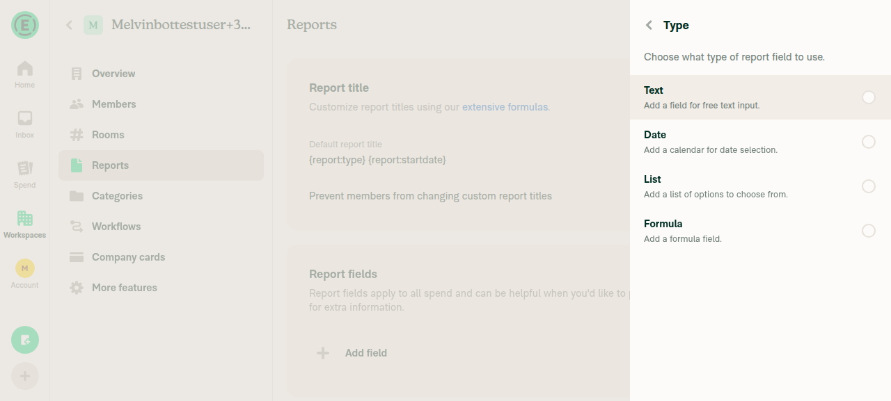
The four field types:

Type selector listing Text, Date, List, Formula

Verified on a Control workspace on web.

I left this alone because filing it under a title that credits this PR would misattribute the change. s77rt — reply with @MelvinBot fix the Report fields article and I will open a separate draft PR for it.


view run · no recording available

@s77rt

s77rt commented Sep 7, 2026

Copy link
Copy Markdown
Member Author

@MelvinBot fix the Report fields article

@MelvinBot

MelvinBot commented Sep 7, 2026

Copy link
Copy Markdown
Contributor

Draft PR created: #100515

Docs updates for E/A#100356 correct Report fields article to match current UIHelpDot label applied, assigned to s77rt, opened as a draft.

It rewrites docs/articles/new-expensify/workspaces/Enable-Report-Fields.md. Every label below was verified against the live UI on a Control workspace before writing.

Accuracy fixes

Article said Product shows
Enable via More Features The toggle is on the Reports tab
Report Fields Report fields
Add Field Add field
Field Type Type
List Values > Add Values List values > Add value
Three types: Text, Date, List Four types: Text, Date, List, Formula
"Make your edits in the right-hand panel" Name and Type are read-only once saved
No mention of Initial value Initial value exists and is required for List fields

The navigation error was the expensive one — an admin following the old article looks under More features, finds nothing, and concludes report fields are missing from their workspace.

Compliance fixes against HELP_AUTHORING_GUIDELINES.md, HELPSITE_NAMING_CONVENTIONS.md, and TEMPLATE.md: collapsed three # headings into one # title plus # FAQ, made every heading task-based, added the missing internalScope metadata, removed a dead (#) link, and added a screenshot suggestion in the required comment format.

The filename is unchanged, so the published URL still resolves. The title became "Create and Manage Report Fields" because the single permitted # heading now has to cover the create, edit, and delete sections.

Checks run: createDocsRoutes.sh passed with routes.yml already current, and npm run spell-changed passed with 0 issues. Lint, typecheck, Jest, and Storybook were skipped — this touches one Markdown file and no application code.


@s77rt, please review the linked help site PR and confirm it reflects the current behavior. Then mark the linked help site PR Ready for review


view run · no recording available

Sign up for free to join this conversation on GitHub. Already have an account? Sign in to comment

Labels

CP Staging marks PRs that have been CP'd to staging

Projects

None yet

Development

Successfully merging this pull request may close these issues.

4 participants