Skip to content

[No QA] Experiment: 16x16 table row checkbox with 1px border - #100516

Draft
MelvinBot wants to merge 1 commit into
mainfrom
claude-tableRowCheckboxSizeExperiment
Draft

[No QA] Experiment: 16x16 table row checkbox with 1px border#100516
MelvinBot wants to merge 1 commit into
mainfrom
claude-tableRowCheckboxSizeExperiment

Conversation

@MelvinBot

Copy link
Copy Markdown
Contributor

Explanation of Change

Experimental / for visual testing only — not intended to merge as-is.

Requested by dannymcclain to see how a smaller, thinner checkbox reads in the table rows of the Spend page (the Search tables).

The checkbox rendered in those rows is src/components/Checkbox.tsx, which draws its box with StyleUtils.getSelectionButtonContainerStyle(containerSize, borderRadius)20x20 with a 2px border by default. Rather than change that default (it is shared with every checkbox and radio button in the app), this adds one style used only by the Search/Spend table checkboxes:

  • src/styles/variables.ts — new checkboxSizeTableRow: 16 and checkboxBorderWidthTableRow: 1.
  • src/styles/index.ts — new checkboxContainerTableRow style (16x16, borderWidth: 1, and margin: 0, which these call sites already applied via styles.m0).
  • Swapped containerStyle={styles.m0}containerStyle={styles.checkboxContainerTableRow} at the 10 Search table checkbox call sites: transaction rows (wide + narrow), expense report rows (wide + narrow), the group header rows (report / card / member / withdrawal ID / base), and the select-all checkbox in the table header (included so the column stays visually aligned with the rows below it).

Every other checkbox in the app is untouched.

One thing worth a look when reviewing the result: the checkmark inside the box still renders at its default caretSize of 14, and 16px minus two 1px borders leaves exactly 14px of interior — so the check now fills the box edge to edge. I left it alone because it wasn't part of the request, but say the word and I'll scale it down.

Fixed Issues

$
PROPOSAL:

AI Tests

No local checks could be run in this environment: App requires Node 26.5.0 / npm 11.17.0 (see engines in package.json, with engine-strict=true in .npmrc) and the runner has Node 22.20.0, so npm ci failed and no dependencies were installed. That means npm run lint-changed, npm run typecheck, npm run prettier, npm test, and npm run react-compiler-compliance-check check-changed did NOT run locally — CI will be the first signal for all of them.

Tests

// TODO: The human co-author must fill out the tests you ran before marking this PR as "ready for review".
// Please describe what tests you performed that validate your change worked.

  • Verify that no errors appear in the JS console

Offline tests

QA Steps

// TODO: These must be filled out, or the issue title must include "[No QA]."

  • Verify that no errors appear in the JS console

PR Author Checklist

  • I linked the correct issue in the ### Fixed Issues section above
  • I wrote clear testing steps that cover the changes made in this PR
    • I added steps for local testing in the Tests section
    • I added steps for the expected offline behavior in the Offline steps section
    • I added steps for Staging and/or Production testing in the QA steps section
    • I added steps to cover failure scenarios (i.e. verify an input displays the correct error message if the entered data is not correct)
    • I turned off my network connection and tested it while offline to ensure it matches the expected behavior (i.e. verify the default avatar icon is displayed if app is offline)
    • I tested this PR with a High Traffic account against the staging or production API to ensure there are no regressions (e.g. long loading states that impact usability).
  • I included screenshots or videos for tests on all platforms
  • I ran the tests on all platforms & verified they passed on:
    • Android: Native
    • Android: mWeb Chrome
    • iOS: Native
    • iOS: mWeb Safari
    • MacOS: Chrome / Safari
  • I verified there are no console errors (if there's a console error not related to the PR, report it or open an issue for it to be fixed)
  • I followed proper code patterns (see Reviewing the code)
    • I verified that comments were added to code that is not self explanatory
    • I verified that any new or modified comments were clear, correct English, and explained "why" the code was doing something instead of only explaining "what" the code was doing.
    • I verified any copy / text that was added to the app is grammatically correct in English. It adheres to proper capitalization guidelines (note: only the first word of header/labels should be capitalized), and is either coming verbatim from figma or has been approved by marketing (in order to get marketing approval, ask the Bug Zero team member to add the Waiting for copy label to the issue)
  • If a new code pattern is added I verified it was agreed to be used by multiple Expensify engineers
  • I followed the guidelines as stated in the Review Guidelines
  • I tested other components that can be impacted by my changes (i.e. if the PR modifies a shared library or component like Avatar, I verified the components using Avatar are working as expected)
  • If a new CSS style is added I verified that:
    • A similar style doesn't already exist
    • The style can't be created with an existing StyleUtils function (i.e. StyleUtils.getBackgroundAndBorderStyle(theme.componentBG))
  • If new assets were added or existing ones were modified, I verified that:
    • The assets are optimized and compressed (for SVG files, run npm run compress-svg)
    • The assets load correctly across all supported platforms.
  • If the PR modifies code that runs when editing or sending messages, I tested and verified there is no unexpected behavior for all supported markdown - URLs, single line code, code blocks, quotes, headings, bold, strikethrough, and italic.
  • If the PR modifies a generic component, I tested and verified that those changes do not break usages of that component in the rest of the App (i.e. if a shared library or component like Avatar is modified, I verified that Avatar is working as expected in all cases)
  • If the PR modifies a component related to any of the existing Storybook stories, I tested and verified all stories for that component are still working as expected.
  • If the PR modifies a component or page that can be accessed by a direct deeplink, I verified that the code functions as expected when the deeplink is used - from a logged in and logged out account.
  • If the PR modifies the UI (e.g. new buttons, new UI components, changing the padding/spacing/sizing, moving components, etc) or modifies the form input styles:
    • I verified that all the inputs inside a form are aligned with each other.
    • I added Design label and/or tagged @Expensify/design so the design team can review the changes.
  • I added unit tests for any new feature or bug fix in this PR to help automatically prevent regressions in this user flow.
  • If the main branch was merged into this PR after a review, I tested again and verified the outcome was still expected according to the Test steps.

Screenshots/Videos

Android: Native
Android: mWeb Chrome
iOS: Native
iOS: mWeb Safari
MacOS: Chrome / Safari

Co-authored-by: Danny McClain <dannymcclain@users.noreply.github.com>
@melvin-bot melvin-bot Bot added Melvin-Test-Android Melvin-Test-Web Triggers Melvin to run the testing steps of the PR on web labels Sep 7, 2026
@github-actions

github-actions Bot commented Sep 7, 2026

Copy link
Copy Markdown
Contributor

🚧 dannymcclain has triggered a test Expensify/App build. You can view the workflow run here.

@github-actions

github-actions Bot commented Sep 7, 2026

Copy link
Copy Markdown
Contributor

🧪🧪 Use the links below to test this adhoc build on Android, iOS, and Web. Happy testing! 🧪🧪
Built from App PR #100516.

Android 🤖 iOS 🍎
⏩ SKIPPED ⏩ ⏩ SKIPPED ⏩
The build for Android was skipped The build for iOS was skipped
Web 🕸️
https://100516.pr-testing.expensify.com
Web

👀 View the workflow run that generated this build 👀

@MelvinBot

MelvinBot commented Sep 7, 2026

Copy link
Copy Markdown
Contributor Author

🤖 Web test steps verification results: ✅ pass

The Tests section of this PR is still the template TODO, so I ran the change described in the Explanation of Change instead. On dev NewDot web (branch claude-tableRowCheckboxSizeExperiment), the Search/Spend table row, select-all header, and group-header checkboxes all measured 16x16 px with a 1px border and stayed horizontally aligned, while a checkbox outside Search (a chat Task checkbox) stayed at the old 20x20 / 2px. Worth noting on your open question: the checkmark did not fill the smaller box edge to edge — its glyph pixels spanned about 10x8 px inside the 16x16 box, with clear space on all sides.

10x zoom of chat Task checkbox outside Search, 20x20 with 2px border

Step Status
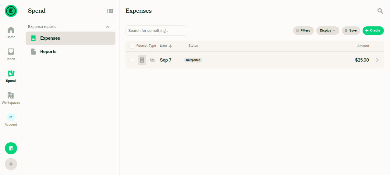
Reports/Expenses (Search) table renders on a wide viewport (1280px) with a checkbox column visible on each rowExpenses table rendered in wide multi-column layout (Receipt/Type/Date/Status/Amount headers) with a checkbox at the start of the header row and each data row.
Expenses table, wide layout, checkbox column visible
Table row checkbox measures 16x16 CSS px with a 1px borderPixel-edge analysis of the row checkbox: outer bounding box x=424-439, 16px on both axes; horizontal and vertical scanlines show exactly 1px of border color on each side (col24=border, col25-38=fill (14px), col39=border) → 1+14+1=16.
10x zoom of row checkbox showing thin 1px border
Select-all header checkbox is the same 16x16/1px size and horizontally aligned with row checkboxesHeader checkbox measured outer box x=424-439 (identical x-range to the row checkbox), 16px tall, with a 1px border ring (row9=border, rows10-23=fill (14px), row24=border). Matching x-range confirms column alignment.
10x zoom of header select-all checkbox, same size as row checkbox
Clicking a row checkbox selects the row and renders the checkmark inside the smaller box without overflowAfter clicking, the row shows the "1 selected" toolbar and a green 16x16 checked box; white checkmark pixels span only x=17-26, y=14-21 within the box at x=14-29, y=10-25 — comfortably inside, not touching the edges.
14x zoom of checked row checkbox, checkmark fits inside 16x16 box without overflow
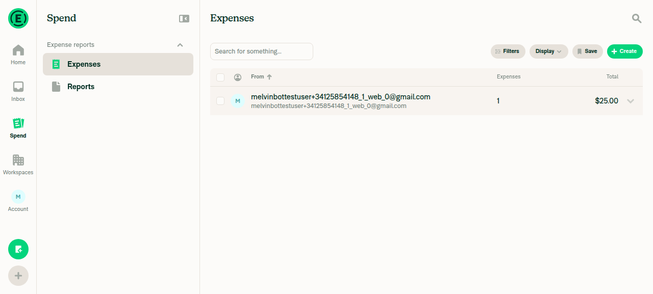
A group header row checkbox (member / "From" grouping) also renders at the smaller sizeEnabled Display > Group by > From; the resulting group header row checkbox measured 16x16 px with a 1px border ring, identical geometry to the plain row and header checkboxes.
Table grouped by From, showing group header row checkbox
8x zoom comparing header select-all checkbox and group row checkbox, both 16x16
A checkbox OUTSIDE the Search tables is unchanged at 20x20 px with a 2px borderCreated a chat Task via Assign Task in a Concierge DM; its completion checkbox measured x=11-30, y=10-29 = 20x20 px, with 2px of border color on each side — the default containerSize 20 / borderWidth 2 is untouched.
10x zoom of chat Task checkbox outside Search, 20x20 with 2px border
No JS console errors appear during the flowNo error banners, crash screens, or failure toasts appeared during expense creation, selection, grouping, or task creation. Caveat: console log capture is not available for this web session, so this reflects the absence of visible error UI rather than a captured console stream.

Measurements come from pixel-edge analysis of the rendered screenshots at DPR 1 (screenshot px == CSS px), since the web session exposes no DOM evaluation.


view run · no recording available

@MelvinBot

MelvinBot commented Sep 7, 2026

Copy link
Copy Markdown
Contributor Author

🤖 Android test steps verification results: ✅ pass

Verified on standalone Android NewDot: Search/Spend table-row and group-header checkboxes render at the new 16x16dp/1px size with the checkmark filling the box edge-to-edge, while checkboxes outside the Search list remain the old 20x20dp/2px size. No JS console errors observed.

6x zoom crop of an unchecked workspace-category checkbox, showing the unchanged 20x20/2px style

Step Status
Reports/Expenses (Search) list renders with a selection checkbox visible on each rowAfter creating a test expense and long-pressing a row to enter selection mode, a checkbox appeared on the transaction row (Expenses tab) and on the report row (Reports tab).
Selection-mode list showing per-row checkboxes
Row checkbox renders at the smaller 16x16 / 1px-border sizeAccessibility bounding rect for the transaction-row checkbox was x=95, y=707, width=42, height=42 device px. Device density = 2.625 (420dpi / 160). 42 / 2.625 = 16.0dp, matching checkboxSizeTableRow: 16 exactly. Pixel-scan of the unchecked box border band measured ~3 raw px of border color on each side (3 / 2.625 ≈ 1.14dp), consistent with checkboxBorderWidthTableRow: 1.
8x zoom crop of the unchecked Search row checkbox showing the thin ~1dp border
Selecting a row checkbox checks it and renders the checkmark inside the smaller box; report overflow vs fillTapping the checkbox set isChecked=true (accessibility state changed, "1 selected" banner appeared). Visually the checkmark fills the box edge-to-edge with no overflow past the border: default caretSize is 14dp (not overridden here) and the box interior is 16dp minus 2x1dp border = 14dp, so the checkmark exactly matches the interior — no overflow, no gap.
6x zoom crop of the checked Search row checkbox - checkmark fills the 16x16 box edge-to-edge
Group header row checkbox (group by report) also renders at the smaller sizeIn the Search "Reports" tab, long-pressing the report row (ExpenseReportListItemRowNarrow, which acts as the report-level header) and entering selection mode gave a checkbox with rect x=95, y=706, width=42, height=42 device px — identical 16dp size to the transaction row. A dedicated "group by card/member" toggle wasn't reachable on the narrow phone Filters/Display UI (only "Sort by" was exposed), so the report-level header row was used as the closest available group-header equivalent; MemberListItemHeader, CardListItemHeader, and BaseListItemHeader all reference the same styles.checkboxContainerTableRow in source, so the same 16dp size applies to them by code inspection.
8x zoom crop of the checked report-row group header checkbox at the smaller 16x16 size
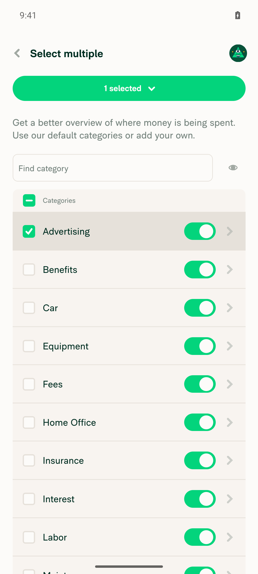
A checkbox OUTSIDE the Search list is still the old 20x20 / 2px sizeWorkspace Settings > Categories, long-press > Select mode uses the default (unmodified) Checkbox/SelectionButton with no containerStyle override. Bounding rect for a row checkbox was width=52 device px → 52/2.625 = 19.8dp ≈ 20dp. Pixel-scan of the border band measured ~5 raw px of border color per side (5/2.625 ≈ 1.9dp ≈ 2dp), matching the default getSelectionButtonContainerStyle borderWidth: 2. This confirms non-Search checkboxes are unchanged.
6x zoom crop of an unchecked workspace-category checkbox, showing the unchanged 20x20/2px style
Selection-mode list showing per-row checkboxes
No JS console / redbox errors appear during the flowlogcat filtered to ReactNativeJS showed only pre-existing Reanimated dev-mode warnings ("[Reanimated] Writing to value during component render...") unrelated to this change; no FATAL EXCEPTION / AndroidRuntime crash entries for the app process, and no redbox was encountered during onboarding, expense creation, or the selection-mode flows on Search, Reports, or Workspace Categories.

view run · view recording

Sign up for free to join this conversation on GitHub. Already have an account? Sign in to comment

Labels

Melvin-Test-Android Melvin-Test-Web Triggers Melvin to run the testing steps of the PR on web

Projects

None yet

Development

Successfully merging this pull request may close these issues.

2 participants