Skip to content

Fix inline-edit pickers overlapping the cell being edited on small-height screens - #100508

Draft
MelvinBot wants to merge 1 commit into
mainfrom
claude-inlineEditPickerOverlap
Draft

Fix inline-edit pickers overlapping the cell being edited on small-height screens#100508
MelvinBot wants to merge 1 commit into
mainfrom
claude-inlineEditPickerOverlap

Conversation

@MelvinBot

@MelvinBot MelvinBot commented Sep 7, 2026

Copy link
Copy Markdown
Contributor

Explanation of Change

When you inline-edit a transaction row in the table (Reports / All Expenses), the Category picker — and the Tag and Date pickers, which share the same logic — opened on top of the cell being edited instead of above or below it. It reproduced whenever the window was short, or when the row sat low enough that the full-height picker did not fit below it.

Root cause. usePopoverEditState measured the anchor cell and, when the picker would not fit below it, set isInverted and returned the cell's top coordinate as the anchor position. But the pickers kept anchorAlignment.vertical: ANCHOR_ORIGIN_VERTICAL.TOP, and with TOP alignment PopoverWithMeasuredContentBase.tsx:147-150 places the popover's top edge at anchorPosition.vertical. So the "inverted" branch never flipped the picker above the cell — it just started the picker at the cell's top edge, i.e. directly over the cell, and computeVerticalShift then nudged it up only as far as needed to fit in the viewport. shouldMeasureAnchorPositionFromTop={!isInverted} had no effect, because the TOP branch assigns result.top regardless of that flag.

Secondarily, the picker had a fixed height of POPOVER_DROPDOWN_MAX_HEIGHT (416), so on a short window it could not fit on either side of the cell and was forced to overlap something.

What changed. Following the guidance on the issue ("I wouldn't add that complexity and just shrink the popover"):

  1. usePopoverEditState.ts now computes the space usable on each side of the cell (reserving the gap to the cell plus the same gap to the window edge), opens below when the preferred height fits there, otherwise takes whichever side has more room, and shrinks the picker to the space actually available — floored at a minimum usable height, below which it stops shrinking and lets the popover be clamped inside the window.
  2. The hook returns the resolved height and an anchorAlignment that uses ANCHOR_ORIGIN_VERTICAL.BOTTOM when opening above, so the popover's bottom edge is pinned to the top of the cell. This is the actual overlap fix: being height-independent, it stays correct even for content that can't shrink.
  3. CategoryPickerModal and TagPickerModal accept the resolved height (their popoverDimensions were hard-coded module constants), passed from CategoryCell / TagCell together with the hook's anchorAlignment.
  4. DateCell passes popoverHeight: CONST.POPOVER_DATE_MAX_HEIGHT to the hook so the side is chosen using the calendar's real height rather than the generic dropdown height. The calendar itself is not shrunk — the bottom-edge anchoring is what keeps it off the cell.
  5. PopoverWithMeasuredContentBase mirrors a changed static popoverDimensions.height into state. Static dimensions skip the onLayout measurement, so popoverHeight would otherwise keep its first-render value and the positioning math would still treat a shrunk picker as 416px tall.

Result: the picker opens below the cell when there is room, flips fully above it when there is not, and shrinks to fit when neither side can take the full height — so it never covers the cell being edited.

AI Tests

Run locally on this branch:

Check Result
npm test -- tests/unit/inlineEditing/editableCellHooks.test.ts ✅ 24 passed (7 new positioning tests)
npm test over 11 related suites (TableTest, PopoverMenuV2Test, TransactionInlineEdit, TransactionItemRowRBRTest, WorkspaceCompanyCardsTableTest, WorkspaceViewTagsTableTest, CategoryPickerTest, CategoryTagPickerAutoFocusTest, usePopoverPositionTest, DateCellTest, editableCellHooks) ✅ 256 passed
npm run lint-changed ✅ pass
npm run typecheck ✅ pass
npm run spell-changed ✅ pass (8 files, 0 issues)
npm run react-compiler-compliance-check check <changed files> ✅ all 7 changed components/hooks compile under both Babel and OXC

npm run prettier is not defined in this repo's package.json and App has no Prettier config; formatting is covered by lint-changed.

Not verified in a browser. The automated web session available to this run reports no hover capability (window.matchMedia('(hover: hover) and (pointer: fine)') is false), so Hoverable stays disabled and the hover-gated edit pencil in EditableCell never appears — clicks fall through to row navigation and startEditing is never reached. The placement logic is covered by the unit tests below instead; the manual Tests / QA steps still need a human on a real browser.

New unit tests in tests/unit/inlineEditing/editableCellHooks.test.ts, stubbing the anchor measurement and window height:

  • Enough room below → opens below at full height, anchorAlignment.vertical === TOP, vertical === y + height + padding.
  • Not enough room below, room above → shouldOpenAbove === true, anchorAlignment.vertical === BOTTOM, vertical === y - padding (bottom edge above the cell), full height retained.
  • Neither side fits (short window) → opens on the roomier side, height reduced to that side's available space, anchor still outside the cell.
  • More room below than above on a short window → shrinks to fit below rather than flipping.
  • Extremely short window → height stops at the minimum usable height instead of shrinking to nothing.
  • Caller-provided preferred height drives the side choice (366px calendar fits below where the 416px dropdown would flip).
  • anchorEdge: RIGHT anchors to the right edge of the cell.

Fixed Issues

$ #88681
$ #82534
PROPOSAL: #82534 (comment)

Tests

// TODO: The human co-author must fill out the tests they ran before marking this PR as "ready for review". Suggested starting point:
// 1. Open Reports > All Expenses with several expenses in the table.
// 2. Inline-edit the Category cell on a row near the top of the table. Verify the picker opens below the cell and does not cover it.
// 3. Inline-edit the Category cell on a row low in the table. Verify the picker opens fully above the cell and does not cover it.
// 4. Shrink the window to a short viewport (e.g. ~500px tall) and inline-edit a Category cell in the middle of the table. Verify the picker shrinks to fit and still does not cover the cell.
// 5. Repeat 2-4 for the Tag cell and the Date cell.

  • Verify that no errors appear in the JS console

Offline tests

QA Steps

// TODO: The human co-author must fill out the QA steps before marking this PR as "ready for review", or the issue title must include "[No QA]."

  • Verify that no errors appear in the JS console

PR Author Checklist

  • I linked the correct issue in the ### Fixed Issues section above
  • I wrote clear testing steps that cover the changes made in this PR
    • I added steps for local testing in the Tests section
    • I added steps for the expected offline behavior in the Offline steps section
    • I added steps for Staging and/or Production testing in the QA steps section
    • I added steps to cover failure scenarios (i.e. verify an input displays the correct error message if the entered data is not correct)
    • I turned off my network connection and tested it while offline to ensure it matches the expected behavior (i.e. verify the default avatar icon is displayed if app is offline)
    • I tested this PR with a High Traffic account against the staging or production API to ensure there are no regressions (e.g. long loading states that impact usability).
  • I included screenshots or videos for tests on all platforms
  • I ran the tests on all platforms & verified they passed on:
    • Android: Native
    • Android: mWeb Chrome
    • iOS: Native
    • iOS: mWeb Safari
    • MacOS: Chrome / Safari
  • I verified there are no console errors (if there's a console error not related to the PR, report it or open an issue for it to be fixed)
  • I followed proper code patterns (see Reviewing the code)
    • I verified that comments were added to code that is not self explanatory
    • I verified that any new or modified comments were clear, correct English, and explained "why" the code was doing something instead of only explaining "what" the code was doing.
    • I verified any copy / text that was added to the app is grammatically correct in English. It adheres to proper capitalization guidelines (note: only the first word of header/labels should be capitalized), and is either coming verbatim from figma or has been approved by marketing (in order to get marketing approval, ask the Bug Zero team member to add the Waiting for copy label to the issue)
  • If a new code pattern is added I verified it was agreed to be used by multiple Expensify engineers
  • I followed the guidelines as stated in the Review Guidelines
  • I tested other components that can be impacted by my changes (i.e. if the PR modifies a shared library or component like Avatar, I verified the components using Avatar are working as expected)
  • If a new CSS style is added I verified that:
    • A similar style doesn't already exist
    • The style can't be created with an existing StyleUtils function (i.e. StyleUtils.getBackgroundAndBorderStyle(theme.componentBG))
  • If new assets were added or existing ones were modified, I verified that:
    • The assets are optimized and compressed (for SVG files, run npm run compress-svg)
    • The assets load correctly across all supported platforms.
  • If the PR modifies code that runs when editing or sending messages, I tested and verified there is no unexpected behavior for all supported markdown - URLs, single line code, code blocks, quotes, headings, bold, strikethrough, and italic.
  • If the PR modifies a generic component, I tested and verified that those changes do not break usages of that component in the rest of the App (i.e. if a shared library or component like Avatar is modified, I verified that Avatar is working as expected in all cases)
  • If the PR modifies a component related to any of the existing Storybook stories, I tested and verified all stories for that component are still working as expected.
  • If the PR modifies a component or page that can be accessed by a direct deeplink, I verified that the code functions as expected when the deeplink is used - from a logged in and logged out account.
  • If the PR modifies the UI (e.g. new buttons, new UI components, changing the padding/spacing/sizing, moving components, etc) or modifies the form input styles:
    • I verified that all the inputs inside a form are aligned with each other.
    • I added Design label and/or tagged @Expensify/design so the design team can review the changes.
  • I added unit tests for any new feature or bug fix in this PR to help automatically prevent regressions in this user flow.
  • If the main branch was merged into this PR after a review, I tested again and verified the outcome was still expected according to the Test steps.

Screenshots/Videos

Android: Native
Android: mWeb Chrome
iOS: Native
iOS: mWeb Safari
MacOS: Chrome / Safari

When the picker could not fit below the cell being inline-edited, usePopoverEditState
returned the cell's top coordinate while the pickers kept TOP anchor alignment, so the
picker's top edge was placed over the cell rather than flipping above it.

Pick the side with room, pin the popover's bottom edge to the top of the cell when
opening above, and shrink the category/tag pickers to the space actually available
(down to a minimum usable height) so they never cover the cell.

Co-authored-by: ahmedGaber93 <ahmedGaber93@users.noreply.github.com>
@MelvinBot
MelvinBot requested a review from a team September 7, 2026 12:34
@melvin-bot melvin-bot Bot added Melvin-Test-Android Melvin-Test-Web Triggers Melvin to run the testing steps of the PR on web labels Sep 7, 2026
@MelvinBot

Copy link
Copy Markdown
Contributor Author

ahmedGaber93 — I created this PR from a branch on upstream Expensify/App because I don't have push access to your fork.

To take ownership of the branch so you can push updates:

git remote add upstream https://github.com/Expensify/App.git
git fetch upstream claude-inlineEditPickerOverlap
git checkout -b claude-inlineEditPickerOverlap upstream/claude-inlineEditPickerOverlap
git push -u origin claude-inlineEditPickerOverlap

Then you can close this PR and open a new one from your fork.

@codecov

codecov Bot commented Sep 7, 2026

Copy link
Copy Markdown

Codecov Report

❌ Looks like you've decreased code coverage for some files. Please write tests to increase, or at least maintain, the existing level of code coverage. See our documentation here for how to interpret this table.

Files with missing lines Coverage Δ
src/CONST/index.ts 91.22% <ø> (ø)
...MeasuredContent/PopoverWithMeasuredContentBase.tsx 77.02% <100.00%> (+0.31%) ⬆️
...components/Search/SearchList/ListItem/DateCell.tsx 84.21% <100.00%> (-0.79%) ⬇️
...ents/TransactionItemRow/DataCells/CategoryCell.tsx 100.00% <100.00%> (ø)
...omponents/TransactionItemRow/DataCells/TagCell.tsx 100.00% <100.00%> (ø)
...sactionItemRow/EditableCell/usePopoverEditState.ts 100.00% <100.00%> (+11.53%) ⬆️
.../components/CategoryPicker/CategoryPickerModal.tsx 3.12% <0.00%> (-7.99%) ⬇️
src/components/TagPicker/TagPickerModal.tsx 4.54% <0.00%> (-4.55%) ⬇️
... and 21 files with indirect coverage changes

@MelvinBot

MelvinBot commented Sep 7, 2026

Copy link
Copy Markdown
Contributor Author

🤖 Android test steps verification results: ⚠️ partial

On standalone Android NewDot, Reports > All Expenses renders the narrow card list (TransactionItemRowNarrow) with no editable Category/Tag/Date table cells, so the inline-edit pickers this PR repositions cannot be opened at all on Android native. Steps 1 and 7 pass; steps 2-6 are unreachable on this platform and need verification on web at a large window width. isEditable = isLargeScreenWidth && !shouldUseNarrowLayout in EditableCell.tsx:70 is always false on native, because useResponsiveLayout/index.native.ts:37-39 hardcodes isSmallScreenWidth = true / isLargeScreenWidth = false, so index.tsx:140 always takes the narrow branch and usePopoverEditState never runs.

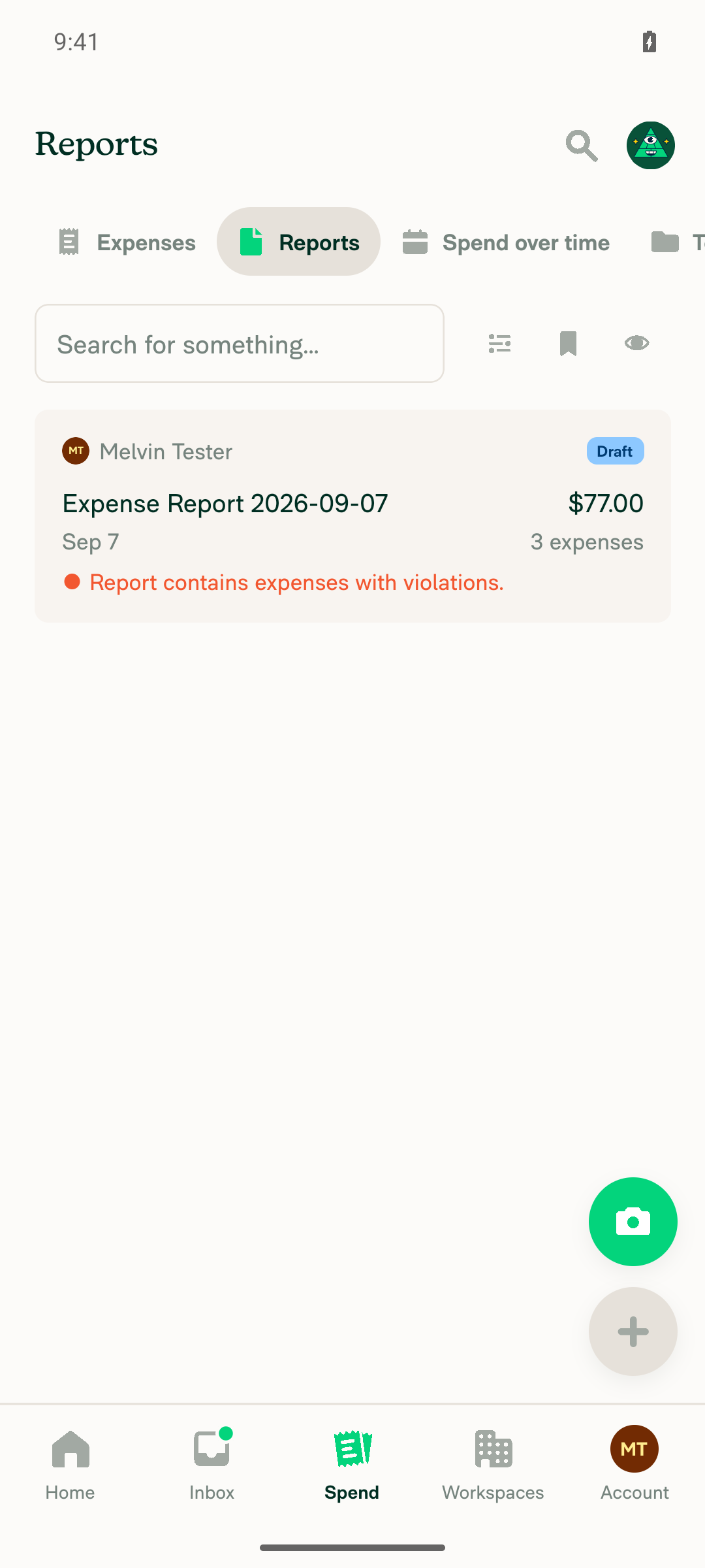
Spend > Reports sub-tab on Android: single report card row, no transaction table

Step Status
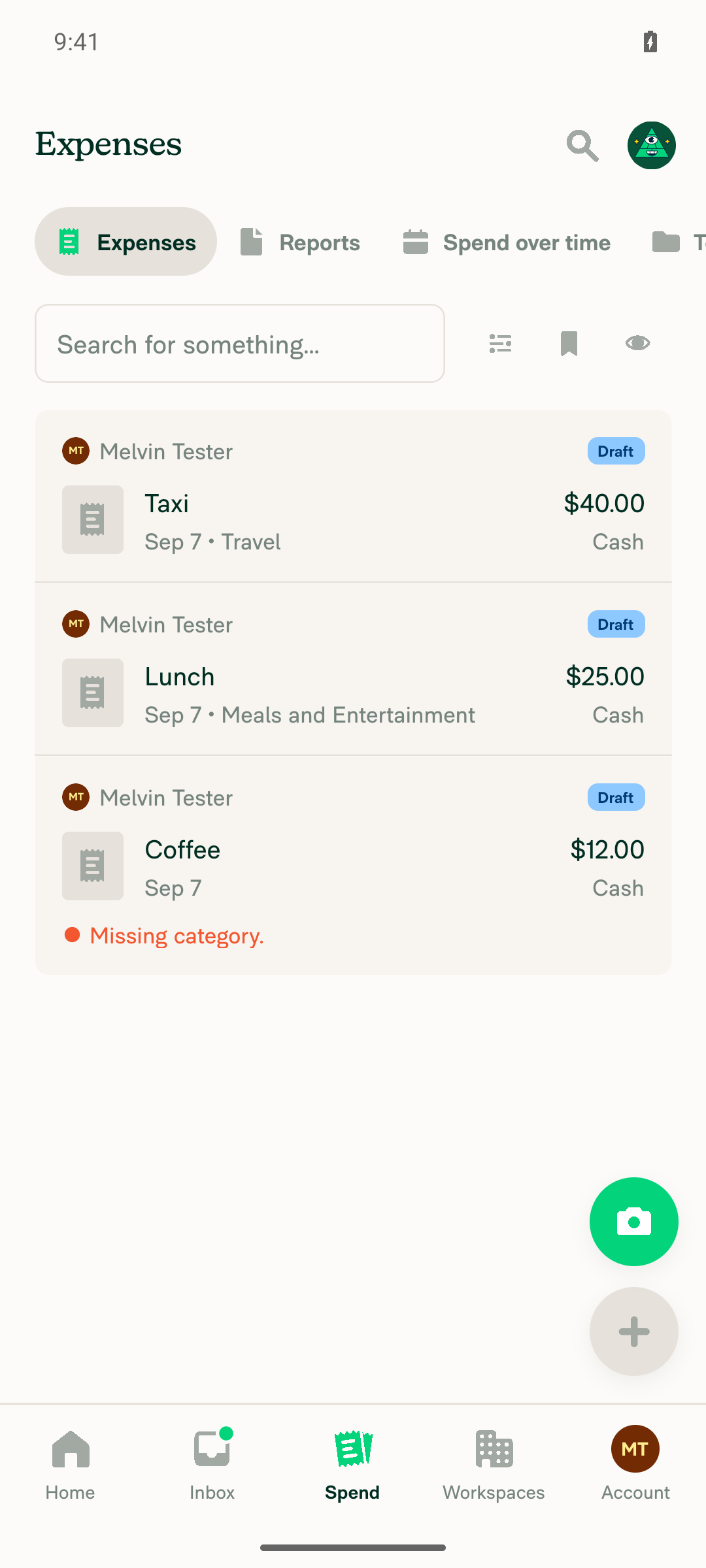
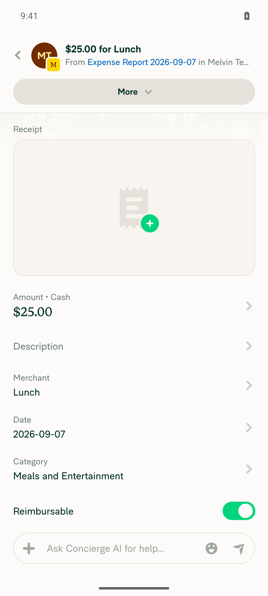
VERIFY 1: Open Reports > All Expenses (expenses table view) with several expenses listedSpend > Expenses opened. Account was fresh (empty state "No expenses yet"), so three manual expenses were created (Taxi $40.00 / Travel, Lunch $25.00 / Meals and Entertainment, Coffee $12.00 / no category). The accessibility snapshot then showed three transaction-item-row rows. The view is a stacked card list, NOT a column table: there are no separate Category/Tag/Date cells — date and category are one concatenated "Sep 7 • Travel" text. The Reports sub-tab likewise shows a single report card, no table cells.
Spend > Expenses on Android before seeding: narrow layout empty state No expenses yet
Spend > Expenses with three expenses as narrow card rows, no Category/Tag/Date table columns
Spend > Reports sub-tab on Android: single report card row, no transaction table
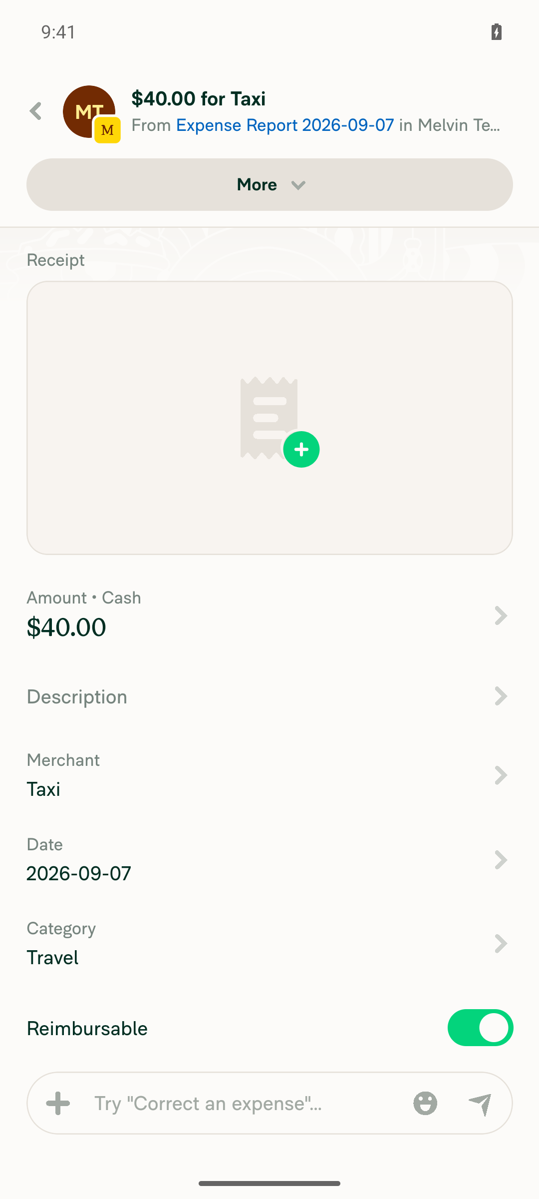
VERIFY 2: Inline-edit the Category cell on a row near the TOP of the table; picker opens below the cell and does not cover itNOT REACHABLE on Android native — not a behavioural failure of the PR. There is no Category cell to inline-edit: the hover/focus pencil that starts inline editing is never rendered (no Edit element matched). Tapping the category text region of the TOP row (Taxi, "Sep 7 • Travel") navigated to the expense detail screen instead of opening a Category popover.
Tapping the top row category area opens the expense detail screen for Taxi 40.00, not a Category picker
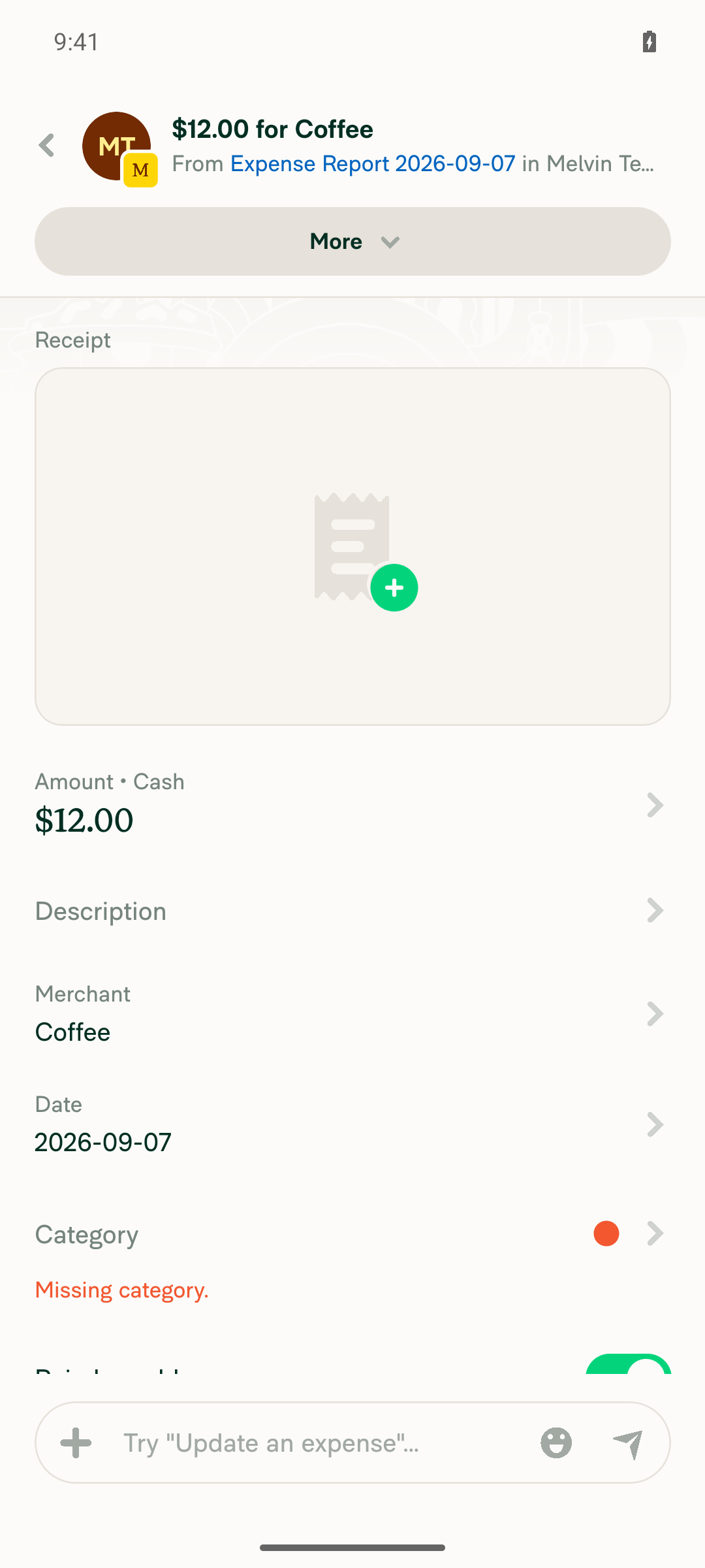
VERIFY 3: Inline-edit the Category cell on a row LOW in the table; picker opens fully above the cellNOT REACHABLE on Android native. Tapping the date/category region of the LOWEST row (Coffee, "Sep 7", "Missing category.") navigated to the expense detail screen; no popover opened, so the above/below flip cannot be exercised on this platform.
Tapping the bottom row Coffee opens the expense detail screen, not a Category picker above the cell
VERIFY 4: Inline-edit a Category cell on a MIDDLE row (short viewport); picker shrinks to fit and does not cover the cellNOT REACHABLE on Android native. Tapping the category region of the MIDDLE row (Lunch, "Sep 7 • Meals and Entertainment") navigated to the expense detail screen. The shrink-to-fit path in usePopoverEditState never executes because no popover-edit cell mounts on narrow layout.
Tapping the middle row Lunch opens the expense detail screen, not a shrunken Category picker
VERIFY 5: Repeat steps 2-4 for the Tag cellNOT REACHABLE on Android native. There is no Tag cell at all in the narrow row: the snapshot of all three rows exposes only avatar/name/status, merchant, amount, "Sep 7 • <category>" and "Cash" — no tag element and no edit affordance. TagCell is only rendered by TransactionItemRowWide, which never renders on native.
Spend > Expenses with three expenses as narrow card rows, no Category/Tag/Date table columns
VERIFY 6: Repeat steps 2-4 for the Date cell (calendar always beside the cell)NOT REACHABLE on Android native. The date is rendered as static concatenated text ("Sep 7 • Travel") inside the narrow row, not as an editable Date cell; tapping it on the top, middle and bottom rows navigated to the expense detail screen each time. The DateCell popover path is wide-layout only.
Tapping the date text of the top row navigates to expense detail instead of opening a calendar popover
VERIFY 7: No JS console / runtime errors during the flowNo redbox, no crash, no JS exception. logcat over the whole run contained no [error], TypeError, "undefined is not", or FATAL EXCEPTION entries — only two benign RN UIManagerHelper: Unhandled SoftException lines (view-unmount races, one before the flow started). Some "Oops... something went wrong" strings appear inside Onyx Search payloads from the expense-creation attempts (including one intentional invalid submit with an empty amount); the Search command itself returned jsonCode 200.

The emulator is 1080x2400 @420dpi (~411dp wide), but native short-circuits the breakpoint regardless of device size, so no Android configuration reaches the wide table. The positioning fix needs to be validated on web at a large window width.


view run · view recording

@MelvinBot

MelvinBot commented Sep 7, 2026

Copy link
Copy Markdown
Contributor Author

🤖 Web test steps verification results: ❌ fail

I could not run any of the documented steps on dev NewDot web. Two blockers stopped the run before a single picker opened: the CI test session was minted as a brand-new account, so Spend > Expenses is empty (no transaction table, no Category/Tag/Date columns to inline-edit); and inline editing is unreachable in this headless browser regardless of data, because hover is inert. hasHoverSupport/index.ts:6 evaluates window.matchMedia('(hover: hover) and (pointer: fine)'), which is false here, so Hoverable/index.tsx:19-22 bypasses ActiveHoverable app-wide and isCellHovered is permanently false. In EditableCell.tsx:142 that leaves shouldShowEditIcon = isEditIconFocused || isCellHovered false, so the pencil stays opacity0, its container keeps pointerEvents='none' and accessible={false} — clicks fall through to row navigation and onStartEditing is never reached. The only remaining route is onFocus via a Tab keypress, and the web surface has no key-press verb (keyboard returns UNSUPPORTED_OPERATION). So the positioning fix in this PR is still unverified at runtime on web.

Same report action after hovering it - identical, no hover toolbar or highlight, proving Hoverable is inert

Step Status
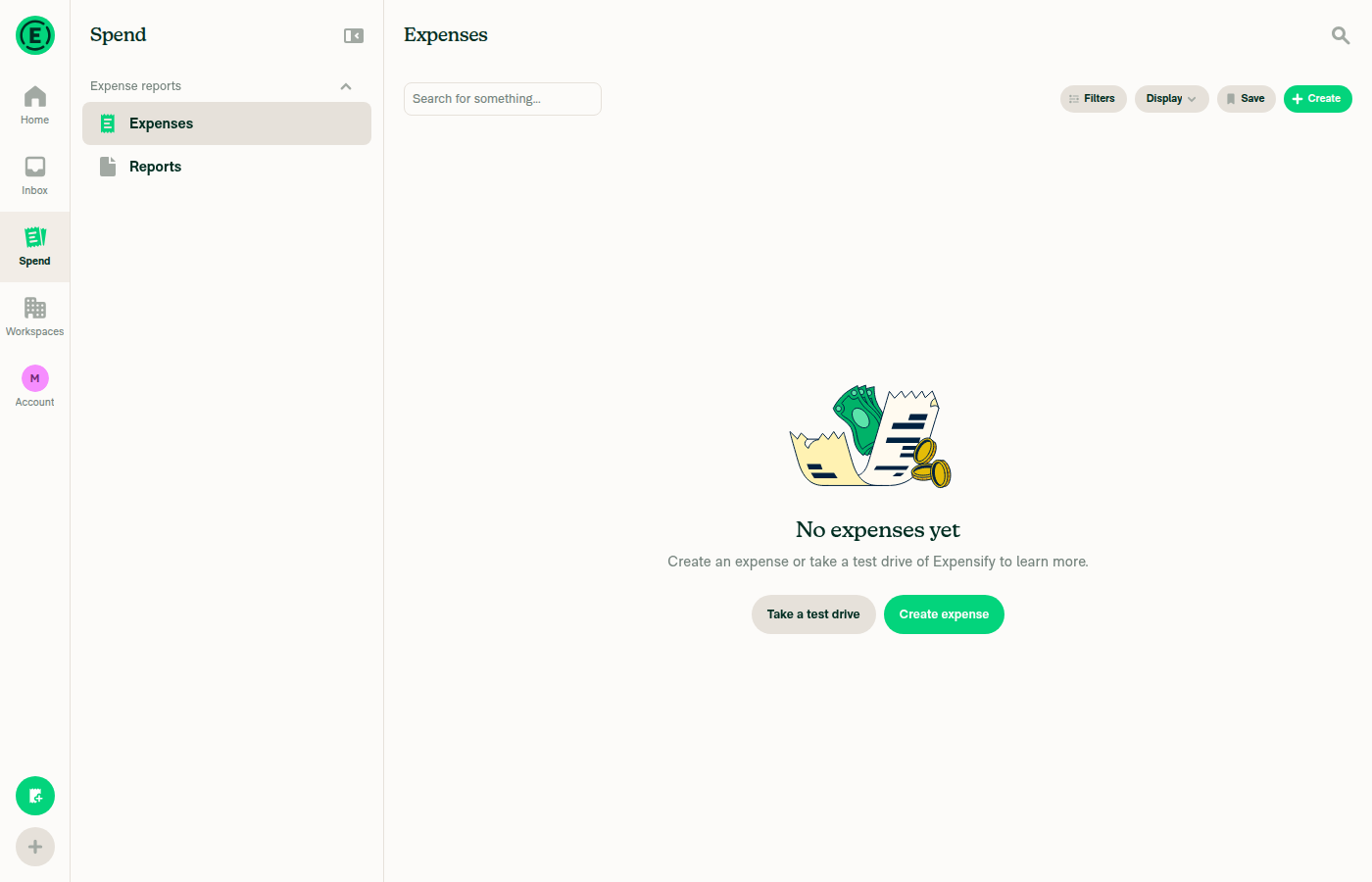
VERIFY 1: Reports > All Expenses shows several expenses in the wide table layout with separate Category, Tag and Date columnsAt viewport 1400x900, Spend > Expenses renders the "No expenses yet" empty state ("Create an expense or take a test drive of Expensify to learn more.") with only Filters/Display/Save/Create controls. The accessibility snapshot contains no table rows and no Category/Tag/Date column headers. The session account was minted fresh by CI this run, so it owns no expenses.
Spend > Expenses at 1400x900 showing the No expenses yet empty state - no transaction table, no Category/Tag/Date columns
VERIFY 2: Category picker on a row near the TOP opens BELOW the cell and does not cover itNot exercised: no expense rows exist (VERIFY 1), and the hover-gated edit pencil that calls startEditing is unreachable in this browser. No picker was opened, so no popover-vs-anchor geometry could be observed.
Empty All Expenses view - no Category cell available to inline-edit
VERIFY 3: Category picker on a row LOW in the table opens fully ABOVE the cell and does not cover itNot exercised for the same two reasons: no rows in the table and no reachable inline-edit entry point.
Empty All Expenses view - no low row available to inline-edit
VERIFY 4: On a short viewport (~1400x500) a middle-row Category picker shrinks to fit and still does not cover the cellNot exercised. The viewport was not resized to 1400x500, because there was no table to inline-edit at 1400x900 and inline editing was already proven unreachable — resizing would have produced no additional evidence.
VERIFY 5: Tag picker always opens beside the cell (below near top, above when low, shrunk on short viewport)Not exercised: no expenses, and a Tag column additionally requires a workspace with tags enabled, which this fresh account does not have.
Empty All Expenses view - no Tag column present
VERIFY 6: Date calendar always opens beside, never on top of, the cell being editedNot exercised: no expense rows and no reachable inline-edit entry point, so no date calendar was opened.
Empty All Expenses view - no Date cell available to inline-edit
Blocker diagnosis: is the hover-gated edit pencil reachable in this headless browser?No. Hovering the Concierge report action returned a settle diff where every interactive node was unchanged (+0 -0), and the post-hover screenshot is pixel-identical to the pre-hover one — no hover highlight and no mini action toolbar, which App always shows on hover for a report action. That confirms hasHoverSupport() is false. Workarounds were unavailable: the browser cannot be relaunched advertising hover/fine-pointer (CI owns the browser launch), there is no page-eval or CDP media-emulation path on the web surface, and there is no key-press verb to Tab onto the pencil.
Concierge report action before hover - baseline
Same report action after hovering it - identical, no hover toolbar or highlight, proving Hoverable is inert
VERIFY 7: No errors appear in the JS console during the flowNot verifiable: browser console capture is not available on this web surface (logs returns UNSUPPORTED_OPERATION). The only available signal, a network dump, showed all requests succeeding (Ping, PusherPing, OpenReport, Log all status 200) with no failures during the drive — but that is not a console-error assertion, and the flow under test never ran.

Combined with the Android run on this PR, which found inline editing is wide-layout-only and therefore unreachable on native, PR #100508 has no runtime verification on either platform yet. Making the web path work needs two harness changes: seed the session account with a workspace plus several categorised and tagged expenses before handing over the session, and launch the browser so it advertises (hover: hover) and (pointer: fine). Until then this fix needs a human on a real browser at a large window width; the placement logic is currently covered only by the unit tests in tests/unit/inlineEditing/editableCellHooks.test.ts.


view run · no recording available

@ahmedGaber93

Copy link
Copy Markdown
Contributor

@MelvinBot This PR name looks not correct? isn't we still open the picker above or bottom the cell not next to it?

@MelvinBot MelvinBot changed the title Open inline-edit pickers next to the cell instead of on top of it Open inline-edit pickers above or below the cell instead of on top of it Sep 7, 2026
@MelvinBot

MelvinBot commented Sep 7, 2026

Copy link
Copy Markdown
Contributor Author

Good catch — "next to" reads as horizontally beside the cell, and that's not what the code does. The picker only ever moves vertically: below the cell when there's room, fully above it when there isn't, shrinking to fit when neither side can take the full height. The horizontal position is unchanged — it stays pinned to the cell's left (or right) edge via anchorEdge in usePopoverEditState.ts:74-79.

I renamed the PR to:

Open inline-edit pickers above or below the cell instead of on top of it

and fixed the same phrase in the Explanation of Change paragraph, which also said "instead of next to it".

One leftover: the commit subject on the branch still carries the old "next to the cell" wording. I left it alone rather than amending an already-pushed commit — let me know if you'd rather it be reworded and I can add a follow-up commit with a corrected message.


view run · view recording

@ahmedGaber93

Copy link
Copy Markdown
Contributor

@MelvinBot rename to "Fix inline-edit pickers overlapping the cell being edited on small-height screens". Also update description if needed.

@MelvinBot MelvinBot changed the title Open inline-edit pickers above or below the cell instead of on top of it Fix inline-edit pickers overlapping the cell being edited on small-height screens Sep 7, 2026
@MelvinBot

MelvinBot commented Sep 7, 2026

Copy link
Copy Markdown
Contributor Author

Renamed the PR to "Fix inline-edit pickers overlapping the cell being edited on small-height screens".

I left the description as-is — it already matches the new title. The Explanation of Change opens with the picker "opened on top of the cell being edited instead of above or below it. It reproduced whenever the window was short, or when the row sat low enough that the full-height picker did not fit below it", which is exactly what the new title says. Nothing in the body contradicts the rename.

One thing worth folding into the description if you want it there — I verified it on an Android emulator on the last run, but did not add it myself since it is outside the rename:

Platform scope. Inline cell editing is wide-layout only. EditableCell.tsx:70 gates it on isEditable = isLargeScreenWidth && !shouldUseNarrowLayout, and useResponsiveLayout/index.native.ts:37-39 hardcodes isLargeScreenWidth = false, so TransactionItemRow/index.tsx:140 always takes the narrow branch on native. This change is only observable on web/desktop at a large window width — it cannot be exercised on Android or iOS native, so those rows in the "all platforms" checklist and their Screenshots sections are not applicable.

Say the word and I'll add it to the body.


view run · view recording

@ahmedGaber93

Copy link
Copy Markdown
Contributor

Two follow-up fixes for the inline-edit date picker (the category/tag pickers are fine):

1. Calendar top gets clipped on short windows

When the picker opens above the cell (ANCHOR_ORIGIN_VERTICAL.BOTTOM), the calendar's top edge can overflow above the window and get clipped by a few pixels.

Screenshot_2026-09-07_at_7 57 57_PM-427964c4-dfe9-

Root cause: DatePickerModal declares a static POPOVER_DATE_MIN_HEIGHT (322) for positioning, but the calendar actually renders taller and month-dependent — pt1(4) + calendarHeader(50) + weekday row(45) + rows×45 + pb4(16) = 340px for a 5-row month, 385px for a 6-row month. Because the dimensions are static, PopoverWithMeasuredContentBase never measures the real height, so the bottom-edge anchoring math reserves too little space and the top overflows. No single constant can fix this since the height varies per month — the fix is to measure it. (The category/tag pickers avoid this because CategoryPickerModal/TagPickerModal force their content to exactly the resolved height via getHeight, so declared == rendered.)

2. Date picker sits flush against the window edge; category leaves a small gap

On a short window the clamped calendar hugs the window's top/bottom edge, whereas the category picker keeps an 8px gap (it reserves POPOVER_MENU_PADDING on both the cell side and the window-edge side, then shrinks to fit). The calendar can't shrink, so give it the same gap via a clamp.

Screenshot 2026-09-07 at 9 54 51 PM
Fix code diff
diff --git a/src/components/PopoverWithMeasuredContent/types.ts b/src/components/PopoverWithMeasuredContent/types.ts
--- a/src/components/PopoverWithMeasuredContent/types.ts
+++ b/src/components/PopoverWithMeasuredContent/types.ts
@@ -20,6 +20,13 @@ type PopoverWithMeasuredContentProps = Omit<PopoverProps, 'anchorPosition'> & {
 
     /** Whether to skip re-measurement when becoming visible (for components with static dimensions) */
     shouldSkipRemeasurement?: boolean;
+
+    /**
+     * Breathing room (in px) to keep between the popover and the window edges when it must be clamped inside the
+     * window. Content that can't shrink (e.g. the calendar) would otherwise sit flush against the edge; a positive
+     * value keeps the same gap the shrinking pickers leave. Defaults to 0 (flush), preserving existing behavior.
+     */
+    windowMargin?: number;
 };
 
 export default PopoverWithMeasuredContentProps;

diff --git a/src/components/PopoverWithMeasuredContent/PopoverWithMeasuredContentBase.tsx b/src/components/PopoverWithMeasuredContent/PopoverWithMeasuredContentBase.tsx
--- a/src/components/PopoverWithMeasuredContent/PopoverWithMeasuredContentBase.tsx
+++ b/src/components/PopoverWithMeasuredContent/PopoverWithMeasuredContentBase.tsx
@@ -55,6 +55,7 @@ function PopoverWithMeasuredContentBase({
     shouldEnableNewFocusManagement,
     shouldMeasureAnchorPositionFromTop = false,
     shouldSkipRemeasurement = false,
+    windowMargin = 0,
     ...props
 }: PopoverWithMeasuredContentProps) {
@@ -184,11 +185,21 @@ function PopoverWithMeasuredContentBase({
         if (anchorAlignment.vertical === CONST.MODAL.ANCHOR_ORIGIN_VERTICAL.TOP) {
             const top = adjustedAnchorPosition.top + positionCalculations.verticalShift;
             const maxTop = windowHeight - popoverHeight - positionCalculations.verticalShift;
-            result.top = Math.min(Math.max(positionCalculations.verticalShift, top), maxTop);
+            let clampedTop = Math.min(Math.max(positionCalculations.verticalShift, top), maxTop);
+            if (windowMargin > 0) {
+                // Keep `windowMargin` of breathing room from the window edges instead of sitting flush against them.
+                clampedTop = Math.min(Math.max(clampedTop, windowMargin), Math.max(windowHeight - popoverHeight - windowMargin, windowMargin));
+            }
+            result.top = clampedTop;
         }
 
         if (anchorAlignment.vertical === CONST.MODAL.ANCHOR_ORIGIN_VERTICAL.BOTTOM) {
-            result.bottom = windowHeight - (adjustedAnchorPosition.top + popoverHeight) - positionCalculations.verticalShift;
+            const bottom = windowHeight - (adjustedAnchorPosition.top + popoverHeight) - positionCalculations.verticalShift;
+            // Keep the popover inside the window. When the space above the anchor is smaller than the popover, pinning
+            // the bottom edge would push the top edge above the window and clip the content, so cap `bottom` at the
+            // value that keeps the top edge inside the window, leaving `windowMargin` of breathing room from the edge.
+            const maxBottom = windowHeight - popoverHeight - windowMargin;
+            result.bottom = windowMargin > 0 ? Math.min(Math.max(bottom, windowMargin), Math.max(maxBottom, windowMargin)) : Math.min(bottom, maxBottom);
         }
 
         return result;
@@ -201,6 +212,7 @@ function PopoverWithMeasuredContentBase({
         windowHeight,
         popoverHeight,
         shouldMeasureAnchorPositionFromTop,
+        windowMargin,
     ]);

diff --git a/src/components/DatePicker/types.ts b/src/components/DatePicker/types.ts
--- a/src/components/DatePicker/types.ts
+++ b/src/components/DatePicker/types.ts
@@ -125,6 +125,14 @@ type DatePickerProps = {
      * Used by inline editing flows that require background dimming.
      */
     shouldEnableMonthYearBackdropInNarrowPane?: boolean;
+
+    /**
+     * Measure the calendar's real rendered height for positioning instead of assuming the static
+     * `POPOVER_DATE_MIN_HEIGHT`. The calendar's height varies by month (5 vs 6 week rows) and exceeds that constant, so
+     * when the popover is anchored by its bottom edge (opening above the anchor) an assumed-too-short height lets the
+     * real top edge overflow above the window and get clipped. Enable this where the popover can open above its anchor.
+     */
+    shouldMeasureContentHeight?: boolean;
 } & Omit<BaseTextInputProps & PopoverWithMeasuredContentProps, 'anchorRef' | 'children'>;

diff --git a/src/components/DatePicker/DatePickerModal.tsx b/src/components/DatePicker/DatePickerModal.tsx
--- a/src/components/DatePicker/DatePickerModal.tsx
+++ b/src/components/DatePicker/DatePickerModal.tsx
@@ -27,6 +27,12 @@ const popoverDimensions = {
     width: CONST.POPOVER_DATE_WIDTH,
 };
 
+// A zero height opts the popover into measuring the calendar's real rendered height (see `shouldMeasureContentHeight`).
+const measuredPopoverDimensions = {
+    height: 0,
+    width: CONST.POPOVER_DATE_WIDTH,
+};
+
 function DatePickerModal({
     value,
     defaultValue,
@@ -46,6 +52,8 @@ function DatePickerModal({
     shouldPositionFromTop = false,
     forwardedFSClass,
     shouldEnableMonthYearBackdropInNarrowPane = false,
+    shouldMeasureContentHeight = false,
+    windowMargin,
 }: DatePickerProps) {
@@ -83,7 +91,8 @@ function DatePickerModal({
             isVisible={isVisible}
             onClose={onClose}
             anchorPosition={anchorPosition}
-            popoverDimensions={popoverDimensions}
+            popoverDimensions={shouldMeasureContentHeight ? measuredPopoverDimensions : popoverDimensions}
+            windowMargin={windowMargin}
             shouldCloseWhenBrowserNavigationChanged={shouldCloseWhenBrowserNavigationChanged}
             innerContainerStyle={isSmallScreenWidth ? styles.w100 : {width: CONST.POPOVER_DATE_WIDTH}}
             anchorAlignment={anchorAlignment}

diff --git a/src/components/Search/SearchList/ListItem/DateCell.tsx b/src/components/Search/SearchList/ListItem/DateCell.tsx
--- a/src/components/Search/SearchList/ListItem/DateCell.tsx
+++ b/src/components/Search/SearchList/ListItem/DateCell.tsx
@@ -77,6 +77,12 @@ function DateCell({date, showTooltip, isLargeScreenWidth, suffixText, shouldUseL
                     onSelected={handleSave}
                     anchorPosition={popoverPosition}
                     anchorAlignment={anchorAlignment}
+                    // The calendar's height varies by month and exceeds POPOVER_DATE_MIN_HEIGHT, so measure it: when
+                    // opening above the cell (bottom-edge anchored) a too-short assumed height would clip the top.
+                    shouldMeasureContentHeight
+                    // The calendar can't shrink, so when it's clamped inside a short window keep the same gap from the
+                    // window edge that the shrinking category/tag pickers leave, instead of sitting flush against it.
+                    windowMargin={CONST.MODAL.POPOVER_MENU_PADDING}
                     shouldPositionFromTop={!shouldOpenAbove}
                     minDate={CONST.CALENDAR_PICKER.MIN_DATE}
                     maxDate={CONST.CALENDAR_PICKER.MAX_DATE}

@ahmedGaber93

Copy link
Copy Markdown
Contributor

@MelvinBot Please implement this fix from claude #100508 (comment)

@MelvinBot

Copy link
Copy Markdown
Contributor Author

⚠️ A setup step failed before I could start. This is usually a temporary issue — try again in a few minutes, and if it persists post in #melvinbot-ai.

Run details

@ahmedGaber93

Copy link
Copy Markdown
Contributor

@MelvinBot Please implement this fix from claude #100508 (comment)

@MelvinBot

Copy link
Copy Markdown
Contributor Author

⚠️ A setup step failed before I could start. This is usually a temporary issue — try again in a few minutes, and if it persists post in #melvinbot-ai.

Run details

@ahmedGaber93

Copy link
Copy Markdown
Contributor

@MelvinBot Please implement this fix from claude #100508 (comment)

@MelvinBot

Copy link
Copy Markdown
Contributor Author

⚠️ A setup step failed before I could start. This is usually a temporary issue — try again in a few minutes, and if it persists post in #melvinbot-ai.

Run details

Sign up for free to join this conversation on GitHub. Already have an account? Sign in to comment

Labels

Melvin-Test-Android Melvin-Test-Web Triggers Melvin to run the testing steps of the PR on web

Projects

None yet

Development

Successfully merging this pull request may close these issues.

2 participants